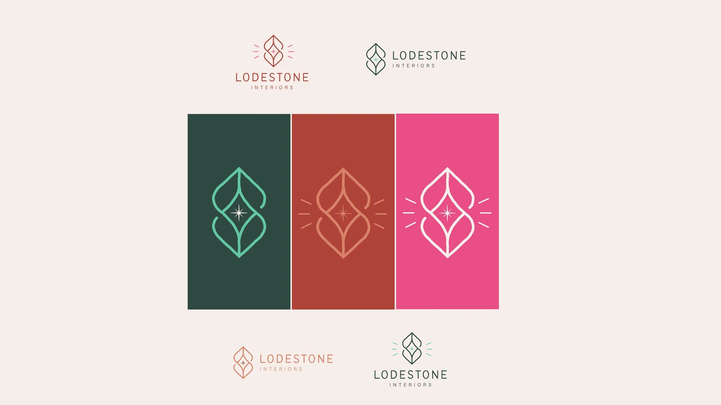
Cohesive Brand Identity for Lodestone Interiors: Promoting Connection & Sustainable Choices
Lodestone Interiors, an interior design firm dedicated to creating spaces that bring people together, had outgrown its initial branding. The old identity was overly complex, hard to reproduce, and didn’t include the company’s name, making it challenging to build recognition. Lodestone’s mission centers on designing spaces that are magnetic, nourishing, uplifting, and sustainable, and they needed a brand that reflected these values.
I developed a cohesive new identity that was simple, recognizable, and aligned with their core philosophy. The primary logo mark is an abstract representation of a lodestone, with lines radiating from the center to illustrate its magnetic force—symbolizing the company’s ability to create inviting, magnetic spaces. The design balances an earthy, organic aesthetic with a professional tone.
Special consideration was given to font selection, ensuring that the brand's integrity could be easily maintained by the Lodestone team, who primarily work in Canva for their marketing materials. The result is a brand identity that is not only visually compelling but also functional and sustainable, just like the interiors they create.


